UNHCR ggplot2 theme for histogramm with big labels for powerpoints
Source:R/unhcr_style_histo_big.R
unhcr_style_histo_big.RdReturn ggplot2 styling for histogram with big labels for powerpoints / slides.
R's default settings for plots are designed to make them legible when viewed on a monitor that is less than half a metre away. When viewed on a TV screen from several metres away, these settings make the axis labels and other text too small to read. For presentations, the base font size should be 18 to 24 points, depending upon the size of the TV and how far away people are sitting.
unhcr_style_histo_big()
Author
Edouard Legoupil - with inspiration from bbc
Examples
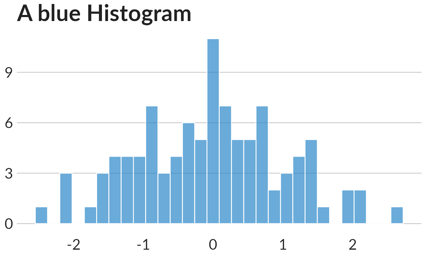
{ library(ggplot2) extrafont::loadfonts(quiet=TRUE) data <- data.frame(x=rnorm(100)) # Basic plot with title ggplot( data=data, aes(x=x)) + geom_histogram(color = "white",fill = "#2a87c8", alpha=0.7) + ggtitle("A blue Histogram") + unhcr_style_histo_big() }#>